


Collection
Google Cloud Next 2024
At Google Cloud Next ’24, we announced updates across every aspect of Google Cloud.
Pixel

-
How to get started with Pixel 8 Pro Camera’s Pro Controls
3 ways to take the best selfies with Pixel Fold

How to use Battery Saver on your Pixel devices

Arts & Culture
-
Explore UNESCO World Heritage newest sites & stories

-
Discover the Czech National Library’s treasures with Google Arts & Culture

-
Discover Portland on Google Arts & Culture

-
New gen AI experiments from Google Arts & Culture artists in residence
-
The Tower of London: A virtual journey through time

-
Experience the Korean Wave and perfect your K-pop dance moves

-
Learn about freshwater on World Water Day
-
Learn about wildlife conservation with Rewild the World

-
Learn about the cultural history of Transport for London

Android
-
5 ways to use the new Find My Device on Android

-
6 Android experiences to see at MWC Barcelona

-
9 new Android features to help you stay productive

-
Find your perfect match this Valentine's Day on Google TV

-
How to quickly share content with nearby devices

-
6 cybersecurity mistakes people make — and what to do instead

-
The power of Google AI comes to the new Samsung Galaxy S24 series

-
5 games to play on Android tablets and foldable phones

-
What we announced at CES 2024
Search
-
Celebrate spring with floral illustrations on Google Books

-
Quiz: Do you know solar eclipse Search Trends?

-
4 ways to use Search to check facts, images and sources online

-
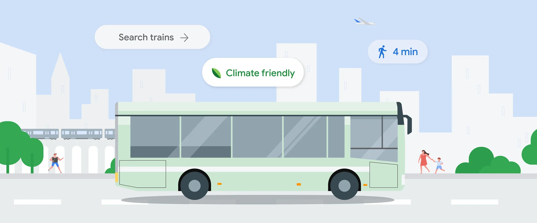
6 ways to travel smarter this summer using Google tools

-
New ways we’re tackling spammy, low-quality content on Search

-
6 AI tools to help you give better gifts

-
Quiz: How well do you know Valentine’s Day Search Trends?

-
5 ways to use Circle to Search
-
New ways to search in 2024

More topics
All stories